
Signs a UX Refresh is Needed ASAP
- Your Website is Slow
Google aims for half a second for load time for website pages because speed can influence rankings. A delayed website results in the user reading less, exiting out of the site and less clicks and browsing on the site. This will ultimately lead to high bounce rates and low conversions. - Feels Out-of-Date
Take a quick look around on the web, check out your competitors and other websites within and outside of your industry. Does your site feel out of date compared to the others? If so, it's definitely time to start thinking about a UX refresh. Bad or no mobile responsiveness, cluttered pages and less than eye-catching photography are all signs it's time to start over with a fresh design. Bottom line–if your site feels out of date, it will make you appear less professional and untrustworthy online. - Your Competition is Doing it Better
If your competitor’s site is cleaner, more informative and overall easier to navigate, it is time to reconsider your website. Be sure to check out their content, rich media and social media to see how you can overall step up your game to beat your competition. - Updates are Painful, Even Small Changes
You shouldn’t have to go through several loopholes to make small changes to your website. Things like changing text, updating pictures and adding landing pages should be simple changes that don’t require an in house developer. Having a website that is easy to use from a CMS standpoint will allow you to keep your website updated easily. - Inconsistency from Page to Page
When looking at your website as a whole, do things look pieced together? Have pages been created over time that don’t go together? Are you using multiple picture styles, fonts and illustration styles? If so, it sounds like it is time to do a refresh from the ground up. For more information on creating a UX experience that is cohesive read our article here. - You are Embarrassed of Your Website
Put simply, you should be proud to showcase your website as the face of your business online. Similarly to being proud to bring clients to your office or headquarters, your website should have a user experience that best displays your brand. If you are embarrassed of your website, give us a shout today for an evaluation so we can create something you will be proud of. - Not Responsive or Mobile Friendly
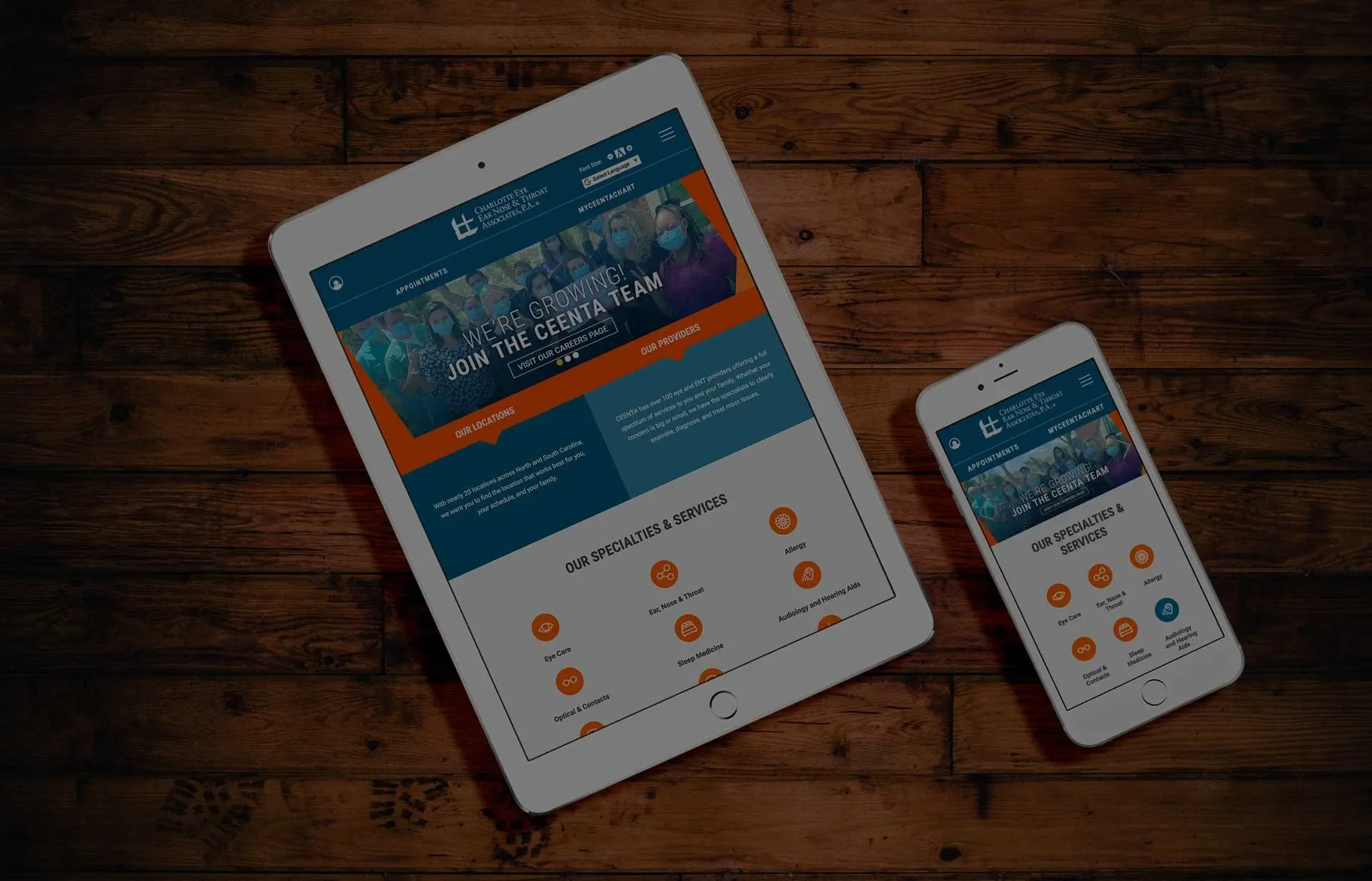
A responsive website will ensure that all users have a good experience visiting your website no matter what device they are on. This is especially important since mobile accounts alone account for over 50% of the traffic online. The mobile version of your website should be a simple version of the desktop site to help with speed and less scrolling. Contact E-dreamz today for a mobile website evaluation. - Hard to Navigate
To make your website easy to navigate you'll want to use simple terms for the main navigation like "About Us", "Contact Us" or "Services." There is no reason to stray away from what people know and what is working. You should also make sure internal sub pages also have easy to find smaller links and sublinks. A top filtering section for products or grid sections of a site can help with this as well. Lastly, make sure your call-to-actions and buttons stand out and are consistent for easy to find important links and sections. - Missing Crucial Elements & Pages
Does your website have engaging content and photography communicating your brand's identity? How about a news and media center displaying the latest updates to your company? And what about a contact page for potential leads to get in touch with you? If you are missing these elements it's time to rethink your website as a whole. At a minimum your site should have: good well-written content, photography, value proposition messaging, contact information/form, news and media and an about us page reinforcing your brand. - High Bounce Rate
Do you ever come across a website within Google search and immediately exit out of it because it wasn't what you were looking for? This is called a bounce rate and if yours is high, it's a red flag that you need to make some changes. To find out what the bounce rate is for your site look in the Audience Overview tab of Google Analytics. Some common reasons for high bounce rates are: poor messaging, slow to load pages, dated design, bad links and too many pop-ups the user has to exit out of to get to the real site content. - Low Conversions
The conversion rate is the number of conversions divided by the total number of visitors. So if you count the number of visitors versus the number of people who contact you, fill out your form or make a sale (if you are eCommerce), you can get a rough estimate of what this might be. The conversion rate can be any action that you want a visitor to make on your website. Bad UX design is a leading contributor to low conversion rates. - Lack of Necessary Integrations
A few different integrations that you'll want on your website include: social media, Google Analytics, payment for eCommerce, testimonials, tools for accessibility and e-mail newsletters. All of these integrations will help with conversion rates, user trust and brand identity. - Not Accessible
Regardless of a user's ability or conditions, they should be able to browse the internet and your website just as well as a person without any impairments or special needs. One way to allow for this is by making sure your site is accessible. Here at E-dreamz, we use a tool called accessiBe which uses powerful AI to ensure each website is accessible for all users.

About the Author
Jane Londeree, Creative Director
Jane Londeree is a Creative Director, designer, and front-end developer with over 20 years of experience turning complex ideas into thoughtful, high-impact digital experiences. At E-dreamz, she oversees all creative and design decisions, blending strong visual storytelling with technical precision. Equally passionate about typography, color exploration, and tackling design challenges, Jane thrives at the intersection of creativity and code. She’s a dedicated advocate for UX accessibility and inclusive web design, believing great design should be usable by everyone. Always curious, she embraces emerging tools like AI in design and Figma to push ideas forward while keeping people at the center of every experience.
« Back to Blog
- Redesigning Healthcare Websites for Accessibility: Lessons from Pinehurst Medical Clinic
- Is It Time to Redesign Your Healthcare Website? What to Know Before You Start
- AI Is Changing Web Design—But Custom Development Still Matters in Healthcare
- Understanding HIPAA Compliance and Website Tracking Tools
- Expanding Graystone Eye’s Digital Ecosystem: A Multi-Brand, Multi-Site Strategy Built for Growth
One Technical Partner. Total Confidence in Your Website.
We handle the platform, compliance, and technical execution - so your team can focus on growth.
© 2026. All rights reserved. E-dreamz, Inc.