
Smart Fonts
As a general rule of thumb less is more when it comes to fonts and font styles, especially when dealing with a website with a lot of heavy content. It is okay to use multiple weights of one font but remember to still not go too overboard. You want the fonts on your website to create a system, a visual hierarchy for how text should be read and to do this you need to be consistent from page to page. A few general tips include:
- Stick to two typefaces maximum, or one with multiple weights.
- Accessibility: Make sure your text is large and provides enough contrast to be read.
- According to Medium.com, you should try to stick to system fonts that are known for being legible on the web and easily accessible.
Photography Style
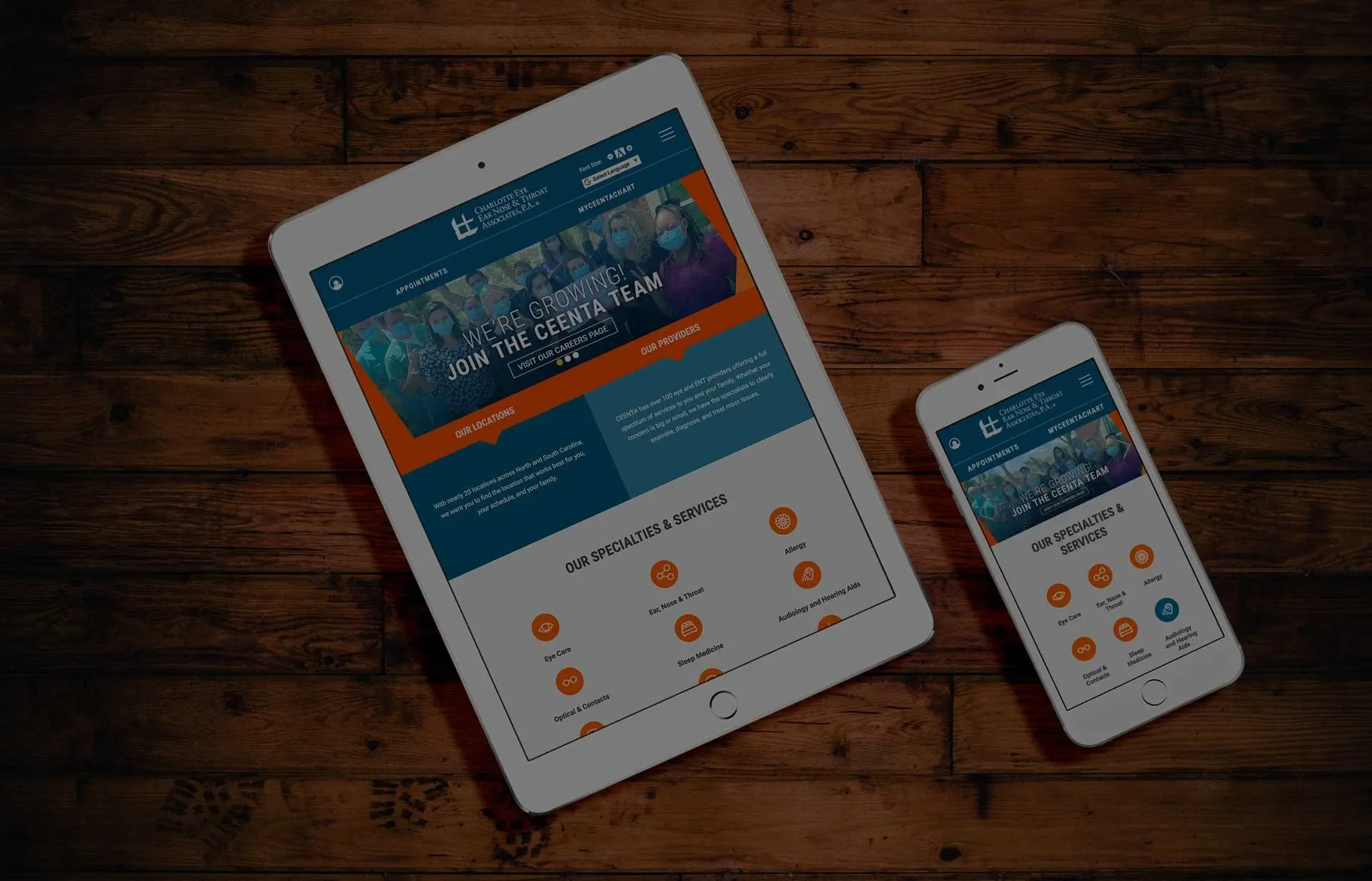
There are many ways to create a photography style that can be utilized cohesively for branding throughout a site. Whether it is putting product photos on the same color background or taking all of your shots at the same angle you can find a way to bring your brand’s imagery together. Apple is a perfect example of a company with a simple, yet highly detailed, photography style that is easily recognizable and an intrinsic part of their identity.
- Along with a cohesive photography style, you’ll want to make sure illustrations, icons and graphics have a similar feel throughout the site pages.
Consistency in Color Palette
To really make your brand look cohesive from start to finish, you need to pick a color scheme and stick with it in all digital materials. This means making sure you send your hex values to developers, designers and anyone else working on your website. When it comes to choosing colors for your website, consider working with the brand’s colors for call-to-actions and important buttons while using neutrals elsewhere and behind large bands of content.
More White Space
Go ahead and double your white space to see how it looks, as most designers do not initially allow enough breathing room in between elements. The good news is that all users these days know to scroll so this shouldn’t worry you when it comes to finding or reading content that is lower on the page. Instead, be sure to opt to allow enough spacing between elements and components so the website is uncluttered and hierarchy is in place.
- Use divider lines or horizontal rules along with white space to create extra separation. These types of divider lines are especially popular on mobile devices.
Simplify Mobile
The mobile experience should be a simplified version of the desktop experience. The mobile site should only include elements and content that is necessary to get information across. This isn’t to say the experience shouldn’t be attractive or aesthetically pleasing, it’s just that simple is best when a user is on their phone.
“Rule of thumb for UX: More options, more problems.”
— Scott Belsky, Chief Product Officer
“Get rid of everything that is not essential to making a point.”
– Christoph Niemann
Article Author: Jane Londeree
« Back to Blog
- The Healthcare Website Performance Checklist for 2026
- Redesigning Healthcare Websites for Accessibility: Lessons from Pinehurst Medical Clinic
- Is It Time to Redesign Your Healthcare Website? What to Know Before You Start
- AI Is Changing Web Design—But Custom Development Still Matters in Healthcare
- Understanding HIPAA Compliance and Website Tracking Tools
One Technical Partner. Total Confidence in Your Website.
We handle the platform, compliance, and technical execution - so your team can focus on growth.
© 2026. All rights reserved. E-dreamz, Inc.