
2022 will be an interesting year with COVID-19 continuing to impact regions around the world. There is now a greater increase in the importance of websites as a whole since people are now at home more working, communicating, and reserving appointments online more than ever. With this being said, we are expected to see a rise in websites improving their overall offerings in general and user interface design needs to be top-notch to support this. Design trends will constantly be evolving from year to year, but 2022 will be unique in that more people are online so things may evolve faster and companies may experiment more. We’ve highlighted a few of the most common elements we expect to become popular or continue to rise.
Plan Content Before Design Choices
We’ve all heard it for years but at the same time, it cannot be stressed enough that a content-first website is always a better approach than a design-first website approach. This is especially necessary with how important fresh and relevant content is for Google rankings and SEO. The truth is, if you do not have a good content strategy, it will be hard for your business to stay competitive and afloat with all of the other healthcare and wellness businesses and basic website services online. Of course, depending on what the content is and how much of it exists, the content alone could impact the way the design should be laid out. You could have the most breathtaking design in the industry but if your content isn’t well-executed then it simply won’t rank well or get you leads. Bottom line, be sure to plan out the content first to ensure you can rank well and take that into consideration before defining design decisions.
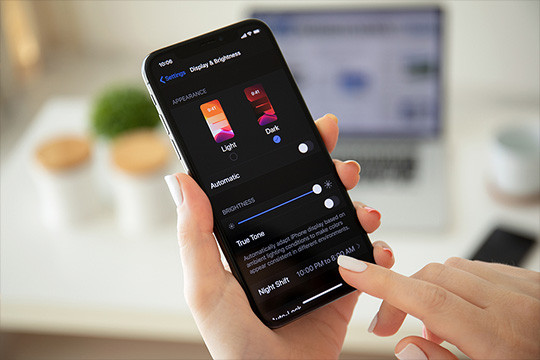
Darker Interfaces & Dark Mode on the Rise
Dark interfaces have become hugely popular in the last year with different applications, especially on mobile and tablet sizes, allowing us to switch to what is commonly now called dark mode. For example, Instagram, Facebook, Apple interfaces, and Androids are now allowing you to view screens in dark mode instead of only being able to view content on a traditional bright white background with dark text. The reason for the dark mode trend is that it is easier on the eye in certain lighting conditions, most ideal for OLED screens which are gaining popularity, it can save on battery power and can make for a sleeker user-interface when designed well. Browsers are also embracing the dark mode trend which is influencing the entire web design industry by not only allowing this option but also making sure a site or application looks good in dark mode. For some websites, dark mode or darker interface design, in general, is the only option proving how big this trend is becoming. For more information on how to properly use and implement dark mode for a website, check out this article from CSS-Tricks.com here.
Unique Provider & Specialty Page Layouts for Doctors
Making your healthcare & wellness website stand out amongst the rise of healthcare experts, especially during COVID-19 when most people are looking online, is key to success. One way to do this is to make your provider and service page layouts visually interesting. Instead of just opting for the traditional layout of a photo on the left, tabs with information, and basic text, we will see the layout enhancements. The baseline content might still be the same but the designs of these types of pages might start shifting towards something more modern, more open, and overall less conventional.
Data Visualization
Data visualization is basically a way of showing collected or dynamic information visually and we expect this trend to rise in 2022 as statistics and facts become important to gain trust on the internet. Data visualization in web design should be informative, clean, well-designed, and not misleading. You want to find a visually appealing way of representing the facts you are trying to portray and also ensure that any numbers or statistics can update in realtime if need be. You can use different types of charts such as graphs, line or pie charts, numbers, statistics, maps, or any combination of these items to portray the information you are trying to relay. It is also a smart design choice to use color to your advantage by using unique color combinations or bright colors to make certain elements stand out or sit back from one another. Lastly, it is also common to incorporate some animation or micro-interactions into your charts or numbers especially upon the initial load.
ADA Compliance
ADA compliant websites are continuously evolving, improving, and becoming a norm as inclusivity is on the rise as a whole. With people working from home and students being at home due to COVID-19, it’s imperative to make sure a site meets the ADA standards so everyone can get their job and schoolwork done despite their situation or disability. To put it simply, an ADA compliant website is tailored to people with disabilities so they can use it well without a struggle. These websites are designed and planned with these folks in mind from the beginning or have ways for certain elements to be altered to comply with ADA standards. A few examples of ADA compliance elements include size adjustable text, voice readers, text transcripts for podcasts, HTML tags & captions, color contrast, and alt text on images. For more information on basic ADA compliance and accessibility, check out the article by Search Engine Journal here.
Article Author: Jane Londeree
« Back to Blog
- Redesigning Healthcare Websites for Accessibility: Lessons from Pinehurst Medical Clinic
- Is It Time to Redesign Your Healthcare Website? What to Know Before You Start
- AI Is Changing Web Design—But Custom Development Still Matters in Healthcare
- Understanding HIPAA Compliance and Website Tracking Tools
- Expanding Graystone Eye’s Digital Ecosystem: A Multi-Brand, Multi-Site Strategy Built for Growth
One Technical Partner. Total Confidence in Your Website.
We handle the platform, compliance, and technical execution - so your team can focus on growth.
© 2026. All rights reserved. E-dreamz, Inc.