
Whether you're considered a Direct-2-Consumer (D2C), Business-2-Consumer (B2C), or Business-2-Business (B2B), having a functional website that presents itself on a mobile device in a usable and visually pleasing way is a critical competitive advantage for a business. Consider any business that's inviting potential customers or clients/partners to learn more about their brand. An organization will want their audience to enjoy their time on their website and leave satisfied that their questions were answered making a positive impression.
As the owner of your website, you possess the capability to create and edit your own website at any given time. If you have an internal team that handles this, or hired a digital marketing agency to manage your website content, having the ability to update your website quickly can determine how adaptable your brand is to your audience.
When designing your website, creating a landing page, posting news / blog, or creating new website components, there are a few tools that can benefit your team to design for responsiveness (mobile-friendly) and appeal to your audience's taste.
#1 - Responsinator
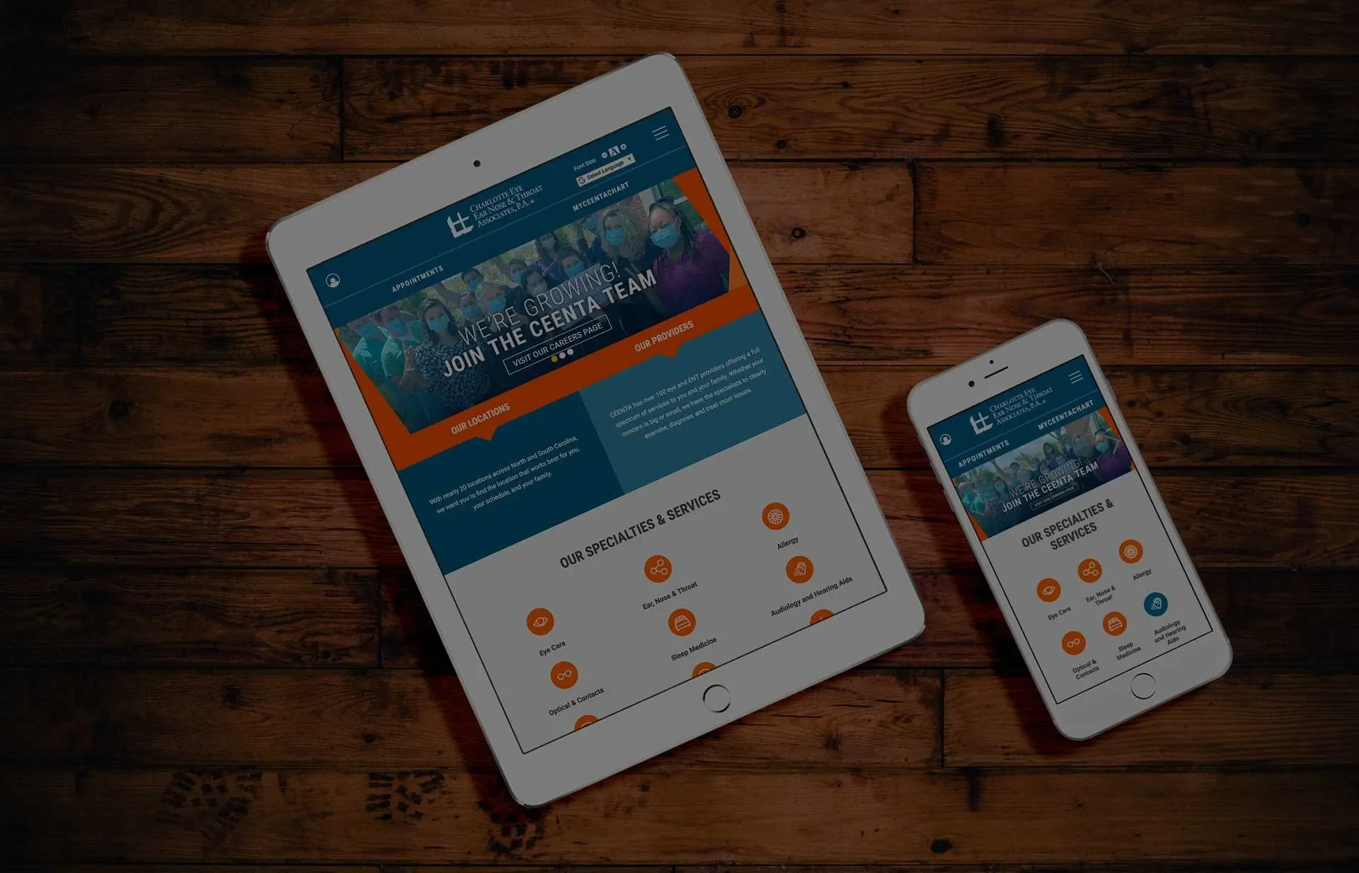
How does your website look on a mobile device, an iPad, an iPhone, Android, or Google phone?
Responsinator lets you add in your website and view it on multiple devices instantly. It's completely free to use and if you're feeling generous, you can donate to the design team at the bottom of the page.
If your website can be viewed online, this is a top tool to use!
#2 - Viewport Resizer
For website administrators, Viewport Resizer is an excellent bonus. It gives you the html tag for viewport tags that will go on your website. You can copy the tags for iOS devices, 11 tablet sizes, 31 mobile devices, 6 widescreen / tv displays, and more. Excellent testing tool!
« Back to Blog
- Redesigning Healthcare Websites for Accessibility: Lessons from Pinehurst Medical Clinic
- Is It Time to Redesign Your Healthcare Website? What to Know Before You Start
- AI Is Changing Web Design—But Custom Development Still Matters in Healthcare
- Understanding HIPAA Compliance and Website Tracking Tools
- Expanding Graystone Eye’s Digital Ecosystem: A Multi-Brand, Multi-Site Strategy Built for Growth
One Technical Partner. Total Confidence in Your Website.
We handle the platform, compliance, and technical execution - so your team can focus on growth.
© 2026. All rights reserved. E-dreamz, Inc.